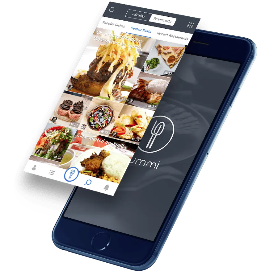

Log Your Foodprints. Never Forget Again.
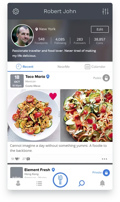
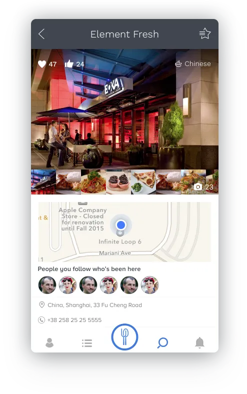
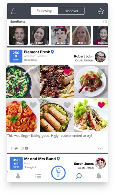
About the App
About the AppYummi is a mobile app that was specially created to help users store their best food memories. It is a platform where you can share your eating experiences, discover different meals, and log food images so that you never forget the fine cuisine you’ve tasted.
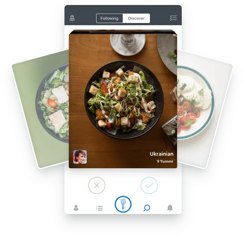
This application is a social utility for all things food that will make every delicious moment of your life easier to remember. Yummi turns your idle food photos into foodprints that are well-organized, catalogued, and tagged. In addition, you can follow friends’ recommendations while deciding where to go and what to eat.
GOALS
GOALS
Give users a tool to create a food diary solely with photos

Enable the ability to easily recall and search through food memories
Provide a platform to discover new and interesting foods
Select and choose popular foodies to follow and get ideas based on your palate
Effectively find great places to eat when you crave something and are nearby
FEATURES
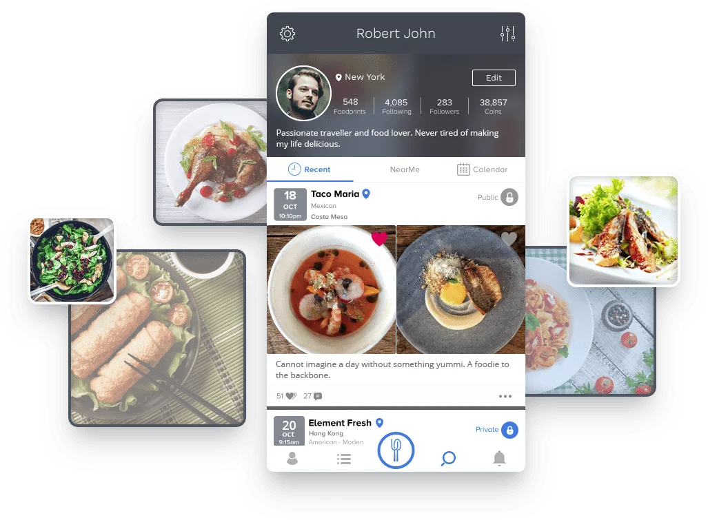
FEATURESFOOD LOG
FOOD LOGA personal food diary that uses photos to chronicle past meals
INTUITIVE CALENDAR
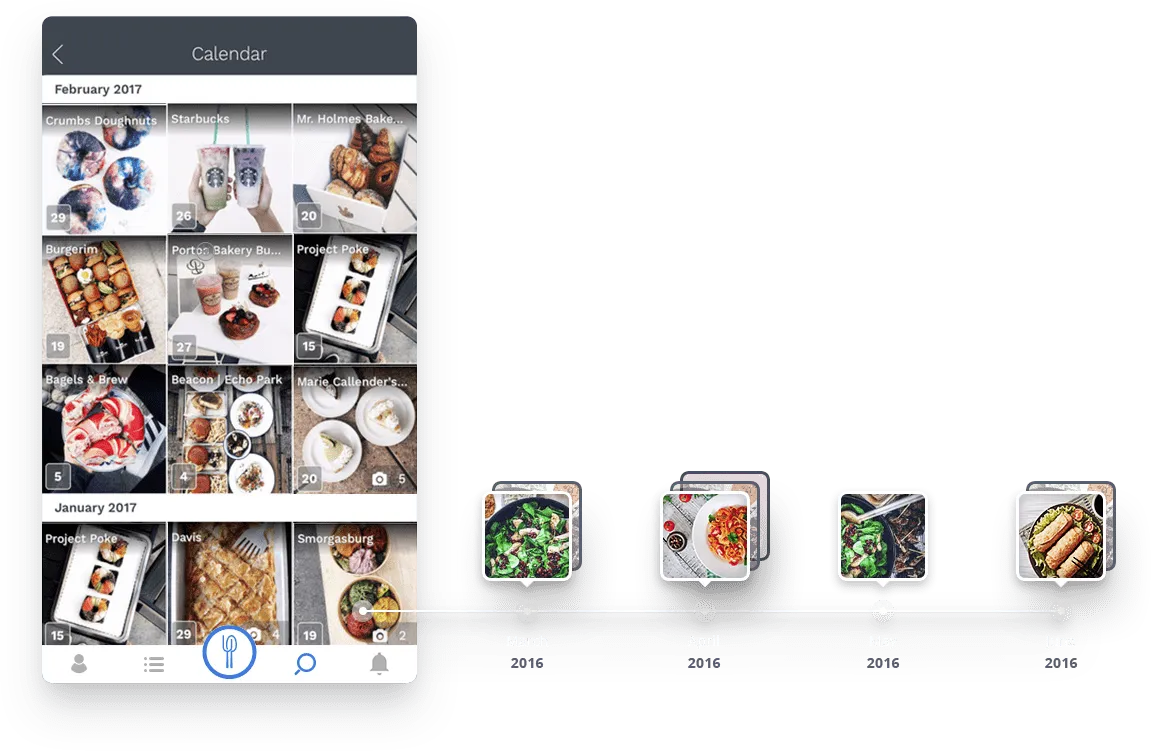
INTUITIVE CALENDARView all posts in a beautiful calendar to recall past food memories. Images are auto organized chronologically by time of meal, not by posting time.
GEOLOCATION TARGET
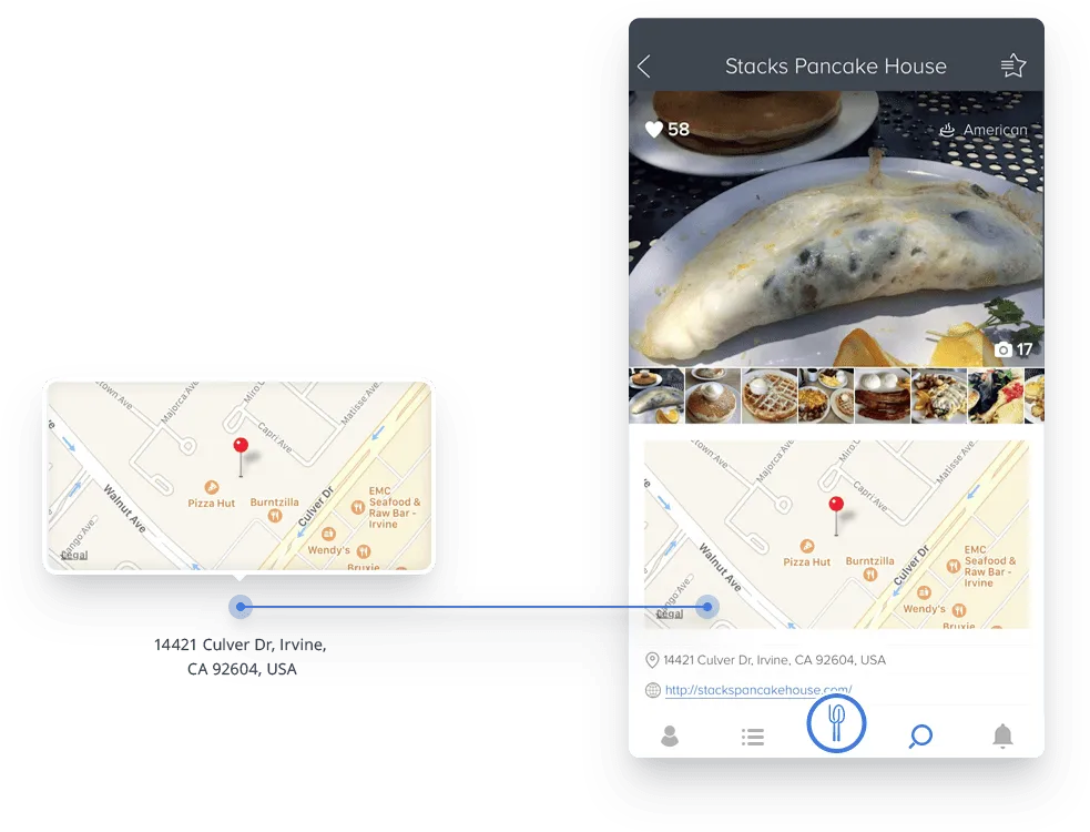
GEOLOCATION TARGETUtilize geotags to identify place location and easily retrieve memories there prior.
Friends’ Feeds
Friends’ FeedsDiscover new ideas based on public posts by friends and popular foodies they may follow
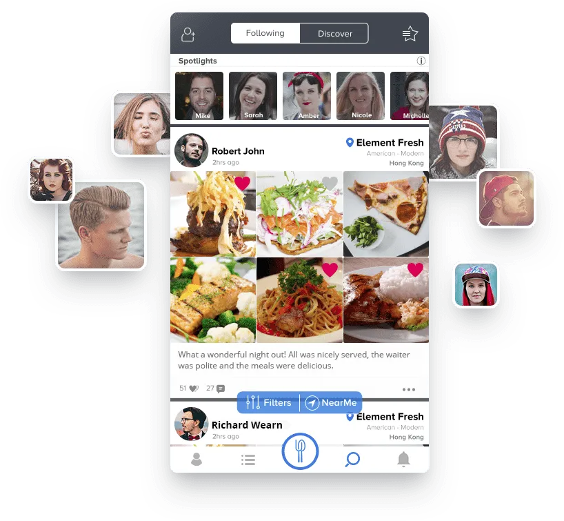
EXPLORE NEARME
EXPLORE NEARMENearMe shows nearby foodprints, sorted according to the distance from the user’s location
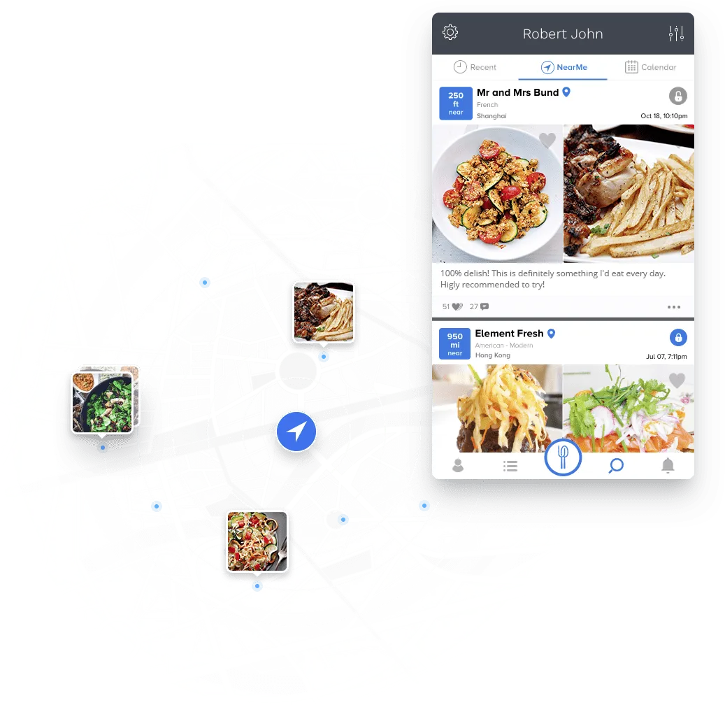
CONVENIENT FILTERS
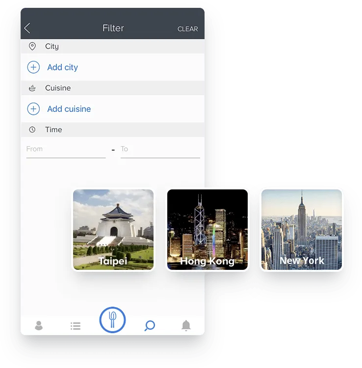
CONVENIENT FILTERSFilter posts by location, cuisine, and time
Robust Search
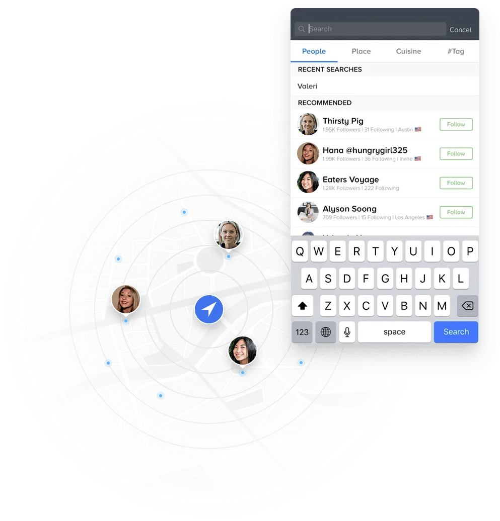
Robust SearchEasily find people, dishes, different cuisines, and look for new places.
Discover
DiscoverExplore delicious eats nearby and befriend new foodies.
Initial Request
Initial RequestThe client wanted to create a food journal for iOS with meal photos and reminders of the places where they were taken. The app was initially planned to be mostly for private use but with sharing options. The customer had the wireframes ready and thus chose to begin our collaboration in the UI stage.

EXECUTED WORK
EXECUTED WORKUI design
UI designThe work on UI mockups began with a style choice. Though the process was quite tedious, the final version met all of the client’s expectations. At the time, the concept of a closed platform was changed to a social network with an option to keep information private. Our designers never stopped creating UI design for the project because new features were being added constantly, even during the development stage.
Total time spent on UI design:
424 hours
424 hours
Color Scheme
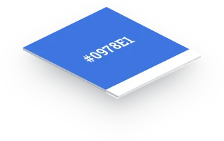
Color SchemeColors and Color Codes
 Active color
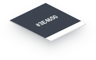 main text
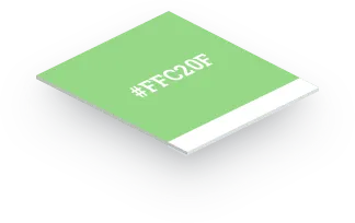 Additional color
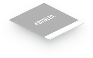 plain text
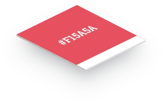 warning color
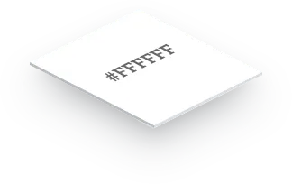 background
Iconography
IconographyIcons set


DEVELOPMENT
DEVELOPMENTAfter the detailed estimate and the backlog were presented to the client, we began developing the app. Having seen the development process and the way the team works, our customer decided to go fully agile. The client set the top-priority functions from the backlog and added new features, all the while taking the developers’ opinions into account. We planned our work two weeks ahead and the client focused on the tasks from the plan. The estimate was kept in mind only as a basis.
TIME REPORT
TIME REPORTThe total volume of work done was much greater than initially planned. We successfully developed the backlog features faster than estimated and completed many additional tasks. The latter influenced the timeframe a bit, but the customer was satisfied with the end result.
iOS
- Estimate of backlog tasks - 971 h
- Actual time spent - 791 h
- Additional tasks - 714 h
- Total time spent - 1505 h
BACK-END
- Estimate of backlog tasks - 815 h
- Actual time spent - 670 h
- Additional tasks - 276 h
- Total time spent - 946 h
FRONT-END
- Estimate of backlog tasks - 208 h
- Actual time spent - 168 h
- Additional tasks - 59 h
- Total time spent - 227 h
In addition to the above totals, the project was continuously guided by a project manager (180 hours spent) and tested by a QA engineer (532 hours spent).
The application was released in June 2016.
PM
- 180 hours spent
QA
- 532 hours spent
Support and Ongoing Work
Support and ongoing workAfter the app’s release, the client received initial feedback from users. Based on their opinions, we continue working on the app to optimize and improve it as well as to add new features. At present, the customer is intensifying his efforts to carry out a successful marketing campaign.
